Non-Photorealistic Rendering
To have a unique aesthetic, many games or movies can go towards a more stylized look. The visuals could resemble something that is drawn by hand instead of a more photorealistic style. This is called non-photorealistic rendering (NPR) and has a lot of creative freedom. Some notable examples from games are Antichamber, the Borderlands series, The Wolf Among Us, Okami, and Need For Speed Unbound. But we also have games like the South Park game series and West of Loathing/Shadows over Loathing, which have a non-photorealistic look but do not apply as many rendering techniques to achieve it. These games are already drawn (not rendered) in a non-photorealistic way. Of course, often, there is a mix of assets created to look non-photorealistic and also applying NPR methods on top of it (in Borderlands, for example, some outlines are already drawn on the textures). Last, we can also consider games like The Simpsons: Hit and Run and Toy Story 2: Buzz Lightyear to the Rescue, which, while kid-like in their visual style, rather use more photorealistic rendering methods.
There are many methods for rendering the different non-photorealistic elements. There is no right or wrong way of doing it, as it all depends on the visual style one wants to achieve. In this chapter, we look at a sample of common NPR approaches and algorithms. Those focus on how the surface is shaded or how we can create outlines for our objects. However, NPR is all about developing new algorithms to render something in a unique style.
Definitions:
- Discretization – Making something continuous to be discrete, grouping it into bins.
- Warm/cold colors – For humans, the colors around orange on the color wheel are considered warm, while colors around blue are considered cold.
- Silhouette – The shape of the object as seen from a particular perspective.
- Silhouette line, object outline, – The border around the whole object as seen from a particular perspective.
- Outlines, border lines – The borders around the different parts of the object (not just the silhouette) as seen from a particular perspective.
- Hatching – The method of shading an object by drawing many lines in the shaded area.
- Cross-hatching – Hatching, but to emphasize an even darker shade, lines are drawn across each other.
Cel Shading
The concept behind cel-shading comes from an old animation technique that used transparent plastic sheets. These sheets were initially made from different cellulose-based materials, giving them the shorthand name cel. This technique was used in old Disney animations like Snow White and the Seven Dwarves (1937) or Pinocchio (1940), but the method was used as early as around 1889. The first Disney film to switch from using physical cels to computer animation was The Little Mermaid (1989). The reason for these transparent plastic sheets was to be able to overlay them on top of a static background painting. Every frame of every animated object was drawn on these cels and photographed in front of the separately drawn background. The animated objects were drawn on the cels by first using a thin brush to draw the borders between differently colored regions, the outlines of different parts of the object. Then paint was used to fill in these regions. That paint was such that it flowed smoothly across the surface of the plastic. This gave the result a distinct look where different parts of the object had outlines and a relatively smooth fill.
In computer graphics, the shading technique designed to mimic, but also to advance that look is called cel shading or toon shading. It can be defined differently, but it commonly consists of two parts: discretizing the colors and drawing black outlines. It differs from the original cel animation technique by usually only using black for the outlines and creating non-outlined regions of illuminated or shaded colors.
Color Discretization
Creating color discretization is an interesting part of cel shading. The first naive approach could be to take the shaded RGB color vector, discretize its length and use that to scale the base color.
That would look like this:
// Do the regular diffuse light calculation
vec3 color = lightCalculation(baseColor);

// Find the length, but scale the color vector first by its max length (sqrt3)
float colorLength = length(color / sqrt3);

// Discretize the length by the bin count
colorLength = round(colorLength * binCount) / binCount;

// Scale the base color by the discretized length
gl_FragColor = baseColor * colorLength;
This gives a result. You can even omit the $\sqrt{3}$ part here. However, there will be issues with doing just that. Notably, if you, for example, wanted two bins and your object is red, then you only get one visible bin. This is because we are discretizing the entire RGB vector by its length. Meaning that if the vector is red $[1, 0, 0]$, then it is already only a third of our entire range. While a good initial first test, we can do better.
We can convert the RGB color to the Hue-Saturation-Value (HSV) color space. This color space's value component varies from black to full colors. So, if we just discretize that component, we should get a quite uniform discretization along any full-colored objects. So, our red objects will also have the same number of bins as white objects. The code for that would be quite similar to before:
vec3 color = lightCalculation(baseColor);

// Convert both the base color and calculated color from RGB to HSV
vec3 baseColorHsv = rgb2hsv(baseColor);
vec3 colorHsv = rgb2hsv(color);

// Discretize the third (value) component of the calculated color
colorHsv.z = round(colorHsv.z * celCount) / celCount;

// Use the hue and saturation components of the base color
colorHsv.xy = baseColorHsv.xy;

// Convert back to RGB for the final output
gl_FragColor = hsv2rgb(colorHsv);
These two approaches are on the example to the right. Notice how the visible number of bins changes with the RGB vector length discretization when you change the color from red to yellow (maxing out green) to white (maxing out blue). With discretizing the value component of the HSV color, this does not happen.
Outlines
There are many different ways to create outlines. It is also important to distinguish if we are talking about the outlines as borders around the different parts of the object or about a single object outline (ie, the border around the silhouette of the object) only. We here call the borders around the object and its different parts outlines (plural). Think of an example of a person holding a hand in front of them. If we look at that person from the front and just think about the silhouette outline, we will not be able to see the hand. But if we also outline the hand, it becomes visible.
In this chapter, we present one approach to rendering outlines. In the following chapters, we will present a different one. Later on, we also look at how to make wider outlines.
For rendering the outlines in cel shading, consider the following two cases:
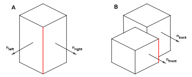
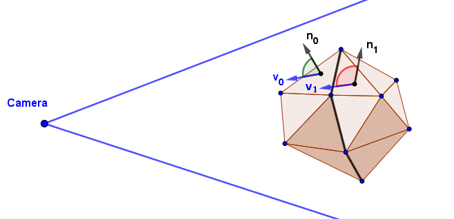
In case A, we can see that there is an edge when the normals on either side of that edge differ. If the difference is greater, the edge is sharper. It makes sense to draw an outline there. So, we need to find the pixels around which the change in the surface normals is big and sudden.
In case B, it is observable that the normals $n_{front}$ and $n_{back}$ are actually the same. For the marked red edge, we cannot just rely on checking if the normals around it are different like we did with case A. Here we rather need to see if there is a big change (a discontinuity) in the position around the edge. For that, we can look at the depth values. If there is a big sudden change in the depth values near a pixel, that is a border pixel.
Note that these really are two different cases. To get the outlines, meaning the outlines of parts of objects, not just the silhouette outline, we need to consider them both. From the Deferred Rendering chapter, you might remember that with that rendering technique, we rendered out the surface normals and depth values to a texture. Here we do a similar thing, we are going to need the surface normals and the depth values as seen from the camera on a texture.
To find the sudden and big changes in normals or depth, we use convolution with the Sobel edge detection kernel. We will look at convolution later on in more detail in the Post-Processing Effects topics. Right now, the quick definition is that it is just sampling the neighboring pixels, multiplying them with specific values defined in a kernel matrix, and then adding all the results together for the new value of the current pixel. Depending on the numeric values in the kernel, we get different operations. For the Sobel edge detection, there are two kernels, which are the following:
$K_{sobelH} = \begin{pmatrix} 1 & 0 & -1\\ 2 & 0 & -2 \\ 1 & 0 & -1 \end{pmatrix} ~~~~~~~ K_{sobelV} = \begin{pmatrix} 1 & 2 & 1\\ 0 & 0 & 0 \\ -1 & -2 & -1 \end{pmatrix}$
So, to find the horizontal changes, we sample neighbors to one side of the current pixel and subtract from them the neighbors to the other side. To be perfectly clear, in convolution, we also flip the kernel's coordinates, so it will be adding the right/bottom values and subtracting the left/top values. But that is not very important for our case here, because we will be interested in the length of the result afterward. If this reminds you of the finite difference methods we used in the Computer Graphics course Bump Mapping task, then you are very keen. This is very similar to what we did there, but the Sobel kernel also considers changes along the diagonal.
After applying both of the filters, we can combine them. We are only interested in the combined size of the change in both directions. Thus, we can combine it by just taking the length of the vector made out of both results. We also apply it for each coordinate of the normal vector and the depth at the same time. The convolution would work on an image, where the normal vectors are in the RGB channels, and the (linear) depth is in the alpha channel.
vec4 s(vec2 offset) {

    vec4 result = texture2D(tex1, (gl_FragCoord.xy + offset) / viewportSize);

    return result;
}

float calculateEdges() {
    vec4 hComp =
     1.0 * s(vec2(-1, -1)) +
     2.0 * s(vec2(-1,  0)) +
     1.0 * s(vec2(-1, +1)) +
    -1.0 * s(vec2(+1, -1)) +
    -2.0 * s(vec2(+1,  0)) +
    -1.0 * s(vec2(+1, +1));

    vec4 vComp =
     1.0 * s(vec2(-1, -1)) +
     2.0 * s(vec2( 0, -1)) +
     1.0 * s(vec2(+1, -1)) +
    -1.0 * s(vec2(-1, +1)) +
    -2.0 * s(vec2( 0, +1)) +
    -1.0 * s(vec2(+1, +1));


    vec4 edgeResult = sqrt(hComp * hComp + vComp * vComp);

    ...
}
To combine the found changes in the normal vector coordinates and depth values together, we add the normal vector coordinate changes and take the maximum of that and the depth change.
float calculateEdges() {
...
vec4 edgeResult = sqrt(hComp * hComp + vComp * vComp);
float edgeFloat = max(edgeResult.x + edgeResult.y + edgeResult.z, edgeResult.w);
...
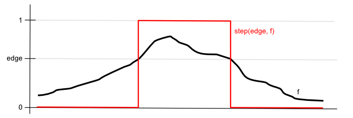
}With the depth change values, we want to threshold them. We want to be able to say at what distance two neighboring pixels are considered to be sufficiently far apart to draw an outline on them. This is a binary choice, so we can use the step(edge, x) function. This function returns $0$ if a value is below a threshold and $1$ if it is above it.
Lastly, we want to also threshold the final combined value. Otherwise, also the smooth normal vector changes become visible in the result. But for this final thresholding, we will use the smoothstep(edge0, edge1, x) function. This one will output $0$, when the value is below the first threshold (edge0) and $1$ if it is above the second threshold (edge1). In the middle, however, it will interpolate via a Hermite curve. This means that there will be a smooth transition from zero to one.
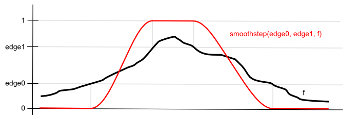
If we set the higher threshold to $1$ and keep the lower threshold as a parameter, we should be able to get control over adding some smaller changes in the normal vectors as semi-transparent outlines. But this can be done differently depending on the creative result you are after.
float calculateEdges() {
    ...

    vec4 edgeResult = sqrt(hComp * hComp + vComp * vComp);

    float depthEdgeFloat = step(depthEdgeThreshold, edgeResult.w); // Hard threshold the depth changes

    float edgeFloat = max(edgeResult.x + edgeResult.y + edgeResult.z, depthEdgeFloat);

    return smoothstep(edgeThreshold, 1.0, edgeFloat); // Smooth threshold the final result
}
You can see this in the example to the right. Of course, to get black outlines, you just subtract the edge value from $1$ and multiply your previously rendered regular object color with it. Keep in mind that all of this we are doing as a post-processing effect on an already rendered scene image.
There are a couple of more things added to the example. We can also change the distance at which we sample a bit. Instead of $1$ coordinate away, we could sample $1 \cdot offsetFactor$ coordinates away. This allows scaling the size of the outline a bit. You can see that if you go overboard with it, the results will not be very good. We cannot get nice wide outlines with just this yet. However, we can use it for small changes. Another addition is that by taking into account the pixel's distance (depth), it is possible to implement a correction that renders the outlines of objects further away a bit thinner than otherwise. Without this correction, the outlines of further away objects become thicker as there will be a larger change per pixel. Both the Offset Factor and Thickness sliders on the right are just scale factors for the sample distance. You can try turning off the Depth Correction and see the outlines of further away objects become thicker.
Links
- Plastic, Paint, and Movie Magic: A Close Look at Disney Animation Cels (2022) – Rachel Mustalish
A very good historical and technical overview of the cel animation technique in Disney. - What Is Cel Animation & How Does It Work? – Claire Heginbotham
Another description of cel animation. - Cel Shading: Creating a cel-shading effect from scratch (2019) – Daniel Ilett
Nice and detailed cel shading tutorial series. Explains the different aspects really well! - Sobel Outline with Unity Post-Processing (2019) – Steven Sell
Blogpost about implementing the Sobel outline also using normals and depth in Unity
Gooch Shading
Non-Photorealistic Rendering methods are not all designed with just artistic value in mind. Some methods also have the additional purpose of highlighting certain details of objects that would be hard to see with regular approaches. One such method is called Gooch shading. This has the goal of shading objects for technical illustrations by having a color gradient on both the illuminated and shaded parts of an object. Of course, this can be used for artistic value as well.
Warm to Cool Shading
People consider some colors to be warm and some cool, depending on the feeling they get when looking at them. Commonly on a color wheel cool colors are on the sector with green and blue. The warm colors are on the sector with yellow, orange, red, and purple. The feeling of warmth or coolness comes from nature. Fire, a source of warmth, is associated with the color orange. Colder things like a cloudless sky, snow, ice, and the sea are more associated with blue and blue-green colors. One more property of cool and warm colors is that warm colors tend to bring objects more to the foreground, and cool colors make objects seem more distant.
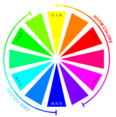
Gooch et al. have used that idea to shade the object such that the lit part will have a warm color added, and the shaded part will have a gradient with a cool color. They have chosen these colors to be blue for the cool color and yellow for the warm color. It is important to remember that the coolness or warmness of color is subjective. Colors on the cool side of the color wheel can be seen as warm when compared to other, cooler colors. The justification by Gooch et al. for picking blue and yellow is that, in that case, there will always be a gradient from a cool color to a warmer color in the result. However, this is not limited to blue and yellow. Mixing any color on the cool side makes a base color cooler, as mixing any color from the warm side makes a base color warmer. Rather why blue and yellow work well is that they are perceived as the darkest and brightest colors. Below is the same color wheel, but it shows the perceived luminance value instead:
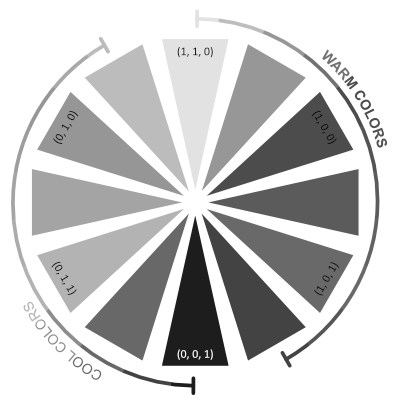
It is visible that yellow is perceived as the brightest and blue as the dimmest color. So, if we are shading the shaded area, we should try to make the color there dark, and when we are shading the lit area, we want to make it brighter compared to the shaded area. Otherwise, the shaded area would give an impression that light is coming from the other direction, even if it does have a cooler color compared to the lit area. For example, coloring the shaded area with cyan (a cool color) and the lit area with red (a warm color) will not be as aesthetically pleasing as using blue and yellow instead.
The shading algorithm is as follows. We first take the diffuse light calculation, but we do not clamp it to zero. Instead we convert the range $[-1, 1]$ linearly to $[0, 1]$. This is easily done by dividing it by $2$ (ie, multiplying by $0.5$) and adding $0.5$. That value will then be used to mix between the cool and warm colors. As mentioned before, these colors will be based on blue and yellow, but the scalars will darken them. In the original article, these scalars are called $b$ and $y$. So far, we have:
vec3 coolColor = b * blue;
vec3 warmColor = y * yellow;

float diffuse = dot(n, l) * 0.5 + 0.5;
vec3 resultColor = mix(coolColor, warmColor, diffuse);
This always results in the same blue-yellow shading regardless of the object's base color. A slice of which is added to the result. This is done by defining the slice by scalar coefficients $\alpha$ and $\beta$ of the full base color and then adding the endpoints of the slice to the cool and warm colors. Like this:
vec3 coolColor = b * blue + alpha * baseColor;
vec3 warmColor = y * yellow + beta * baseColor;

float diffuse = dot(n, l) * 0.5 + 0.5;
vec3 resultColor = mix(coolColor, warmColor, diffuse);
This is it. Defining this slice and making the cool and warm colors darker is to help with the result not becoming overly bright. Note that this is quite subjective, as NPR algorithms usually are.
The result is shown in the example to the right. We have chosen blue and yellow to be configurable. You can see what happens if you use cyan and red instead. Another change is that we have converted the colors to HSL color space to darken the blue and yellow. In that color space, the third component is Lightness, which is the average of the minimum and maximum RGB components. As all the colors on the color wheel only have the maximum of two non-zero RGB components (they are always between only two of the red, green, or blue primaries), then changing the Lightness value is effectively the same as multiplying the RGB color with a scalar. This can be considered a more generalized approach to what is described in the original article.
Observe the scheme on the bottom of the example to see how the color gradients change when you change the algorithm parameters.
This example has also rendered outlines. These outlines are found and rendered in a different way than before. This is described in the next subchapter.
Links
- A Non-Photorealistic Lighting Model For Automatic Technical Illustration (1998) – Amy Gooch, Bruce Gooch, Peter Shirley, Elaine Cohen
The original paper by Gooch et al. Very good explanation, goes on to render metal surfaces. - Formula to Determine Perceived Brightness of RGB Color
A StackOverflow thread that lists the different formulae for converting RGB color to a perceived brightness value.
Silhouette Outline
The outline in the Gooch Shading example was made differently than the outlines in the Cel Shading example. You can see visual differences. For example, there is no border between the spikes and the head of the doll model. These borders were there before because that was an area of big and sudden surface normal change. However, the outline in the Gooch Shading example does not consider surface normals or depth. Rather, it works by finding existing silhouette edges in the geometry, similar to the Shadow Volume algorithm from the previous Computer Graphics course.
The idea starts with key observations that every edge has exactly two faces it connects, and the silhouette edges are the ones where one face is facing toward the camera and another is not. The assumption that every edge has two faces it joins limits this algorithm to solid meshes. For every frame, we just need to go through all the edges of the polygon, find the silhouette edges, and render these separately. Determining if the face is facing the camera is as easy as taking the dot product between $v$ and $n$, and seeing if it is negative or not.
To render these edges separately, one can construct a duplicated geometry, copy the indices of the silhouette vertices, and render its wireframe with a little bit larger scale than the original mesh. This is exactly what is done in the previous example.
At the moment, this approach of finding the silhouette edges on the CPU is faster for me than performing the Sobel convolution pass on the GPU. However, this very much depends on the rendering resolution and the scene complexity. We have a very simple scene with just a few objects. With larger meshes and complex scenes, it is possible to write a probabilistic algorithm that does not check through all of the edges every frame. It is worth noting that the silhouette edges often make up a loop. So, if you find one, you can follow along its neighbors to discover the whole loop.
Links
- Real-Time Nonphotorealistic Rendering (1997) – Lee Markosian, Michael A. Kowalski, Daniel Goldstein, Samuel J. Trychin, John F. Hughes, Lubomir D. Bourdev
The paper on the probabilistic algorithm for finding the silhouette edges. - Silhouette Edges
A math wiki page describing the general algorithm of finding silhouette edges.
Outline Width
So far, we have seen two algorithms for rendering the outlines. One looked at the depth and normals of each pixel to render the edges at pixels where either of those changed suddenly. The second one discovered the edges that formed the object's silhouette and rendered these as a separate mesh. There are other algorithms too, but regardless of the choice, making the outline bigger is usually a big challenge.
Similar to how we sampled the neighbors of pixels for the Sober convolution, we could again sample the neighbors and extend the edge to the current pixel if one of the neighbors is already an edge pixel. This has the problem of having to make a new expensive rendering pass for every pixel of the desired outline width. Ben Golous has in his extensive blog post found a better way. The main idea is to use an algorithm called jump flood. Instead of doing $w$ passes, where $w$ is the desired width, we can do only $\lceil log_2(w) \rceil$ passes.
For example, if we want an outline 8 pixels wide (including the initial pixel), we need to perform ($log_2(8)=3$) three iterations like this:
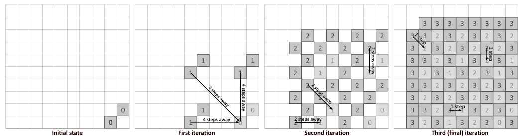
In every iteration, we sample the neighbor from a decreasing power of two steps away. The last iteration needs to be $1$ step away, so for three iterations, the step sizes will be $4$, $2$, and $1$. In the first iteration, we sample neighbors that are horizontally, vertically, and diagonally $4$ pixels away from the current position. If any of these neighbors is a filled value, we fill the current value. In the next iteration, we repeat the process with the step size $2$, and include the values filled in the previous iteration. In the penultimate iteration, we get a checkerboard-like pattern, and the last iteration fills the last gaps.
Currently, we only looked at one side of the outline, but a similar process will happen on the other side as well. So, the resulting wide outline spans both sides of our initial outline. Considering this, our three iterations create an outline $16-17$ pixels wide, depending on the initial state. This means that if we are okay with the outline also spanning inside the object, we may be able to do one iteration less. With two iterations, we would get a double-sided outline with a total width of $8-9$ pixels. However, this might not be what we always want. If we care about only the outline that spans outwards from the mesh, then our previous estimated number of iterations will be correct.
What if we want an outline that is not a power of two wide? There is a way to control which pixels we want to color as part of the outline and which we do not, based on a more granular distance from the initial border. We set the initial state values in the render texture to have the UV coordinates in each texel. Then, when one of the sampled neighbors in some iteration has a value, we have two cases. In case the current texel is empty, we write the value of the sampled neighbor to the current texel. But if the current texel already has a value, we check if the sampled neighbor value has a shorter distance to the current texel's own UV coordinate. If yes, we overwrite the current value. If not, we keep the current value. This is played out here:
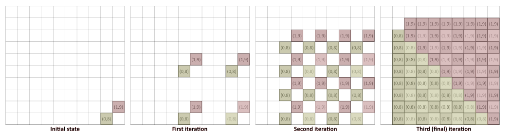
We used integer coordinates $(0,8)$ and $(1,9)$ to make the example more readable. In the implementation, these would be UV coordinates. Notice that many of the coordinates set on the second iteration will be overwritten in the third one. Texels that have $(0,8)$ also have neighbors, which have the $(1,9)$ value. And if that seed texel (one that is actually at the coordinate $(1,9)$) is closer than $(0,8)$, then the value $(0,8)$ will be overwritten by $(1,9)$. The same thing happens the other way around too. In the end, we get a texture where these outline texels have the coordinates of their closest seed texel. If this sounds like a Voronoi diagram, then this is exactly what it is! The jump flood algorithm (JFA) we just learned is what is commonly used for the creation of Voronoi diagrams.
However, now we can easily filter out these texels, which are too far away from the seed texels. For example, if we want our outward spanning outlines to be $6$ pixels wide, we see if the distance (with respect to the viewport) between every texel's own UV coordinate and the closest seed value it stores is more or less than $6$. If it is more, we do not draw it. If it is less, we draw it as an outline pixel. There are different optimizations and improvements you can do this approach, many are described by Ben Golous.
On the right, there is an example, which implements this. The initial outlines come from the silhouette edge rendering approach we described before. The parameter $N$ is the power of the two of the last iteration we do. If $N=0$, we do only one iteration, with $N=2$, we do iterations with $4$, $2$, and $1$ neighbor sampling, etc.
Notice that if our desired outline width is larger than what the JFA gives us, the outline will not match the object outline. In the case of a sphere, the JFA gives a more rectangular result. This is because we sample only horizontally, vertically, and diagonally with the same step size, resulting in a rectangular stencil.
When you visualize the Edges or JFA alone, each pixel has its seed UV coordinate shown as the color.
Links
- The Quest for Very Wide Outlines: An Exploration of GPU Silhouette Rendering (2020) – Ben Golus
Very well written explanation and a thorough deep dive into this problem.
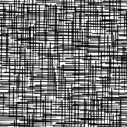
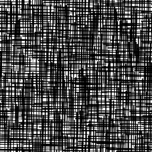
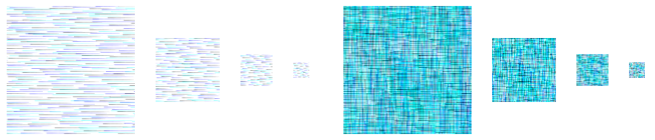
Hatching
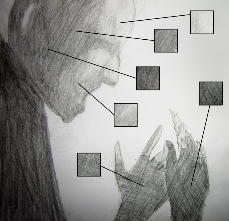
The last NPR algorithm we describe is for rendering shades of objects with hatching. In traditional drawing, one technique to represent different shades is to draw individual lines with varying density and direction. You can layer those lines such that you first draw lines with larger spacing, then, where the shade is supposed to get darker, you draw more lines with smaller spacing. If the shade is getting even darker, you can draw the new lines at an angle to the previously drawn lines, resulting in cross-hatching. In the pencil drawing below, while the pressure of the pencil stroke has also played a big role, the different hatchings are what also contributes to the varying tones.
The algorithm by Praun et al. to shade the objects with hatching samples the hatching pattern from pre-made textures. These textures are called Tonal Art Maps (TAMs). The authors have a separate generator script to make these textures. The generator takes as input an image of a single stroke. This can be made by the artist and will depend on the look they want to achieve. This stroke is then copied multiple times on different textures. The more it is pasted to one texture, the darker tone that texture will take. A specified number of differently toned textures are then generated. For example, here are six such textures:
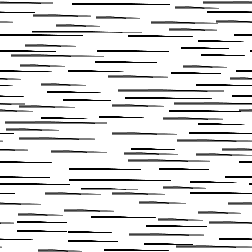 |
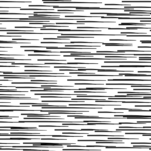 |
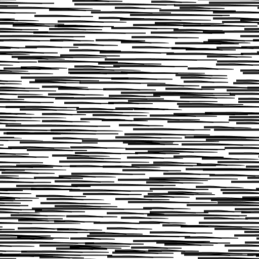 |
 |
 |
 |
It is important here that every stroke on any texture is also present on the textures to the right of it. To create darker hatching, we add new strokes.
Another thing to consider is that objects farther away should still have the same kind of stroke used for shading. This means that regular mipmapping will not produce the desired result. If an object is far away, there should still be hatching that corresponds to the same tonality of the shade. For that, these strokes have to be both smaller, and there has to be less of them. However, the ones that are there have to match to existing strokes when the object is bigger in the projection.
These two properties are tone coherence and resolution coherence. When the tone of the shade changes, new strokes are either added or removed because the lighter tone TAMs are subsets of darker tone ones. When the resolution changes, we also use subsets of higher-resolution TAMs, with the caveat that the strokes themselves will be smaller. So, the generator by Praun et al. generates, and we need to use the images in the following structure:
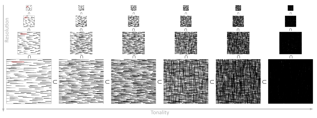
On the example to the right, you can compare the use of only the largest texture and standard mipmapping with the approach where lower-level mipmaps are the generated hatching ones. Notice how with standard mipmaps the objects far away start to get a uniform gray shade. However, with our hatching mipmaps, the objects far away will still look like an artist has dawn hatching on them.
To transfer and sample these TAMs effectively, Kyle Halladay has described in his blog post a way to pack the data of multiple tonalities into the RGB channels of a single texture. This makes sense as for each of these tones, we only use one channel worth of data. Our hatching is grayscale. At the moment, we split the six tonalities into two three-channel textures for each resolution. With seven or eight tones, we could also use the alpha channel.
Here is a simple Python OpenCV script that reads three images and sets the values of the red, green, and blue channels of the result image from them.
import cv2
import numpy as np

def parseImage(fileName1, fileName2, fileName3, resultFileName):

    image1 = cv2.imread(fileName1, cv2.IMREAD_UNCHANGED)
    image2 = cv2.imread(fileName2, cv2.IMREAD_UNCHANGED)
    image3 = cv2.imread(fileName3, cv2.IMREAD_UNCHANGED)

    result_image = np.zeros(image1.shape)
    result_image[:] = (255, 255, 255) # Fill it with white

    result_image[:,:,2] = image1[:,:,0] # OpenCV is BGR (red = 2)
    result_image[:,:,1] = image2[:,:,0] # Set the data
    result_image[:,:,0] = image3[:,:,0]

    cv2.imwrite(resultFileName, result_image) # Write the file

# One call for each resolution level of the first three tones, starting from the darkest
parseImage('default20.png', 'default10.png', 'default00.png', 'hatching00.png')
parseImage('default21.png', 'default11.png', 'default01.png', 'hatching01.png')
...
# One result for each resolution level of the second three tones, starting from the darkest
parseImage('default50.png', 'default40.png', 'default30.png', 'hatching10.png')
parseImage('default51.png', 'default41.png', 'default31.png', 'hatching11.png')
...
This results in images like this:
One more thing we did here with these was that we scaled them down 50%. Meaning that the 512 px texture was scaled to 256 px, etc. This gave us a more aesthetically pleasing result later in the render.
To sample the texture, we first find the pixel intensity from our regular diffuse calculation. This will be the tone, by which we need to sample the textures. Here we also added a scale, offset, and exponential parameters for more artistic control. We then multiply the intensity with six, because we had six tones, and create a vector from that value.
float diffuse = max(0.0, dot(n, l));
float intensity = diffuse * intensityScale + intensityOffset;
intensity = pow(intensity, intensityExponent);
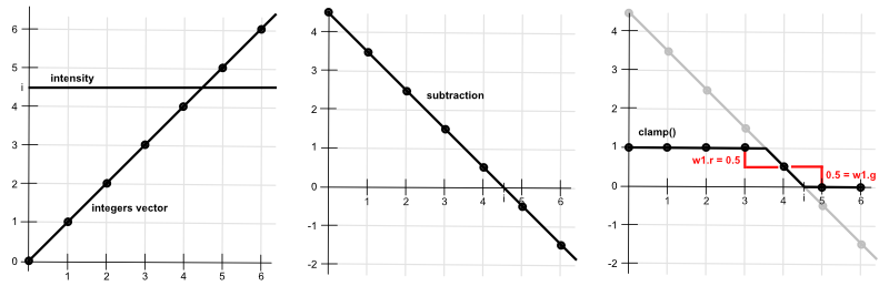
vec3 intensityVec = vec3(intensity * 6.0);Now we have a value which, if there is no scale, offset, or exponent, would be from one to six. For the following explanation, we can assume this is the case. We want to know which texture and color channel to sample based on that value, which we now denote $i$. If $i \in [0, 1)$, we want to sample the red channel of the first texture. If $i \in [1, 2)$, we want to sample the green channel of the first texture. And so on, until $i \in [5, 6]$, we want to sample the blue channel of the second texture. On the GPU writing, some if-statements for it would not be that optimal. Instead, we can sample both textures, which gives us all the channels anyway and then multiply those by some weights. These weights should be weights of a convex combination, ie sum to $1$ and $w_i \in [0, 1]$. This is what Kyle Halladay has shown in their blog.
The trick Kyle proposes is to subtract a vector of integer values from $0$ to $5$ from a $6$-element vector of intensity values. In the implementation, this will be done with vec3-s, but to see how this even works, we look at the process as a whole. For each element, we subtract from the intensity the integer value. We then clamp the result to $[0, 1]$. Lastly, we subtract from every element their next element.
| 1. subtract integers | $\pmb{i - 0}$ | $\pmb{i - 1}$ | $\pmb{i - 2}$ | $\pmb{i - 3}$ | $\pmb{i - 4}$ | $\pmb{i - 5}$ | |
| 2. $c = \text{clamp}(x, 0, 1)$ | $\pmb{c(i-0)}$ | $\pmb{c(i-1)}$ | $\pmb{c(i-2)}$ | $\pmb{c(i-3)}$ | $\pmb{c(i-4)}$ | $\pmb{c(i-5)}$ | |
| 3. subtract next element | $\pmb{c(i-0)}-c(i-1)$ | $\pmb{c(i-1)}-c(i-2)$ | $\pmb{c(i-2)}-c(i-3)$ | $\pmb{c(i-3)}-c(i-4)$ | $\pmb{c(i-4)}-c(i-5)$ | $\pmb{c(i-5)} - 0$ | |
| 4. result | w0.r |
w0.g |
w0.b |
w1.r |
w1.g |
w1.b |
We play this out with a couple of values. First, with $i = 0.75 \cdot 6 = 4.5$ like is done by Kyle as well:
| 1. subtract integers | $4.5-0 = 4.5$ | $4.5 - 1 = 3.5$ | $4.5 - 2 = 2.5$ | $4.5- 3=1.5$ | $4.5 - 4=0.5$ | $4.5 - 5=-0.5$ | |
| 2. $c = \text{clamp}(x, 0, 1)$ | $c(4.5)=1$ | $c(3.5)=1$ | $c(2.5)=1$ | $c(1.5)=1$ | $c(0.5)=0.5$ | $c(-0.5)=0$ | |
| 3. subtract next element | $1-1=0$ | $1-1=0$ | $1-1=0$ | $1-0.5=0.5$ | $0.5-0 = 0.5$ | $0 - 0=0$ | |
| 4. result | $\pmb{0}$ | $\pmb{0}$ | $\pmb{0}$ | $\pmb{0.5}$ | $\pmb{0.5}$ | $\pmb{0}$ |
Very nice, we now have two of the weights that sum to $1$, and the rest are zero. Notice that during the second step we get a vector that consists of only $1$-s, $0$-s, or in the maximum two values, which are between $0$ and $1$. This results from subtracting an increasing vector of integers and clamping the result.
There is a slight problem with this. Currently, if our $i \in [5, 6]$, we sample the texture with the highest tone. That texture is not of a completely white tone, it still has hatching on it. However, we would like for the hatching to transition to completely white at some point. This is why we need to have the intensity offset from before We also add another single float weight w2 to the process. Now that $i$ can grow over $6$, we can check out what happens $i=1.1 * 6 = 6.6$:
| 1. subtract integers | $6.6-0 = 6.6$ | $6.6 - 1 = 5.6$ | $6.6 - 2 = 4.6$ | $6.6- 3=3.6$ | $6.6 - 4=2.6$ | $6.6 - 5=1.6$ | $6.6 - 6=0.6$ |
| 2. $c = \text{clamp}(x, 0, 1)$ | $c(6.6)=1$ | $c(5.6)=1$ | $c(4.6)=1$ | $c(3.6)=1$ | $c(2.6)=1$ | $c(1.6)=1$ | $c(0.6)=0.6$ |
| 3. subtract next element | $1-1=0$ | $1-1=0$ | $1-1=0$ | $1-1=0$ | $1-1 = 0$ | $1 - 0.6=0.4$ | $0.6 - 0=0.6$ |
| 4. result | $\pmb{0}$ | $\pmb{0}$ | $\pmb{0}$ | $\pmb{0}$ | $\pmb{0}$ | $\pmb{0.4}$ | $\pmb{0.6}$ |
We see that there is $0.4$ contribution from the last hatched texture and then w2 has the value $0.6$. That value we will add to the final pixel color. So, if the intensity is $1.1$, our pixel will interpolate between $60%$ full white and $40%$ last hatching texture.
Graphically this process would look like this:
Notice that by subtracting the values, we are basically taking the forward difference. Ie, how much the value changes between each step.
There is one more problem here. To show it, we check out what happens when $i=0.05 \cdot 6=0.3$.
| 1. subtract integers | $0.3-0 = 0.3$ | $0.3 - 1 = -0.7$ | $0.3 - 2 = -1.7$ | $0.3- 3=-2.7$ | $0.3 - 4=-3.7$ | $0.3 - 5=-4.7$ | $0.3 - 6=-5.7$ |
| 2. $c = \text{clamp}(x, 0, 1)$ | $c(0.3)=0.3$ | $c(-0.7)=0$ | $c(-1.7)=0$ | $c(-2.7)=0$ | $c(-3.7)=0$ | $c(-4.7)=0$ | $c(-5.7)=0$ |
| 3. subtract next element | $0.3-0=0.3$ | $0 - 0=0$ | $0 - 0=0$ | $0 - 0=0$ | $0-0 = 0$ | $0 - 0=0$ | $0 - 0=0$ |
| 4. result | $\pmb{0.3}$ | $\pmb{0}$ | $\pmb{0}$ | $\pmb{0}$ | $\pmb{0}$ | $\pmb{0}$ | $\pmb{0}$ |
Our weights do not sum up to $1$, the only non-zero weight is $0.3$. This means that the shade will interpolate to full black. However, this is not what we want. With hatching, the full black is on the last TAM. Depending on the stroke, it might not even be fully black. There might be gaps between the strokes, or the stroke color might not have been black, etc. So, it definitely should not interpolate to full black in the shade. To fix that, we set the first weight always to be $1$ before the subtraction step.
So, finally, the code would be like this:
vec3 intensityVec = vec3(intensity * 6.0);

vec3 w0 = clamp(intensityVec - vec3(0.0, 1.0, 2.0), vec3(0.0), vec3(1.0)); // Here we subtract the integers and clamp the results
vec3 w1 = clamp(intensityVec - vec3(3.0, 4.0, 5.0), vec3(0.0), vec3(1.0));
float w2 = clamp(intensityVec.x - 6.0, 0.0, 1.0); // For adding the final interpolation to white

w0.x = 1.0; // To stop the interpolation at the last hatch texture, not going to black

// Subtracting the next values, ie, finding the forward difference
w0.xy -= w0.yz;
w0.z -= w1.x;
w1.xy -= w1.yz;
w1.z -= w2;

vec3 h0 = texture2D(hatchTexture1, uv).rgb * w0; // Sample hatch textures and multiply by weights
vec3 h1 = texture2D(hatchTexture2, uv).rgb * w1;

vec3 result = vec3(h0.r + h0.g + h0.b + h1.r + h1.g + h1.b + w2); // This is the pixel color
On the right there is an example of that. You can separately visualize the intensity, the weights mapping, and the final result. You can change the UV scale and rotation to make the textures smaller or larger on the surface and also to rotate them. Note that rotation just rotates the UV space. Regarding that, you might notice the seams on the model. Hatching is quite susceptible to seams. There are techniques, like the lapped textures approach described by Praun et al., which apply the hatching dynamically across the surface, minimizing the visible UV seams.
Then you can try to play around with the intensity offset, scale, and exponent to create different intensity gradients and corresponding hatching. You can also see how the intensity and weights change when you do that. Lastly, there are five different strokes to try out. All of these have separately generated TAMs.
Links
- Real-Time Hatching (2001) – Emil Praun Hugues Hoppe Matthew Webb Adam Finkelstein
The main article about the hatching algorithm described here. - A Pencil Sketch Effect (2017) – Kyle Halladay
A blog post about implementing that algorithm and the weight calculation.